Pls&Thx
Project collaborators:
Anita Zheng, Genice Cahndra, Luxvna Uthayakumar
Project Role:
Research, Design Thinking, Visual Identity, Prototyping, User Testing,
Video production
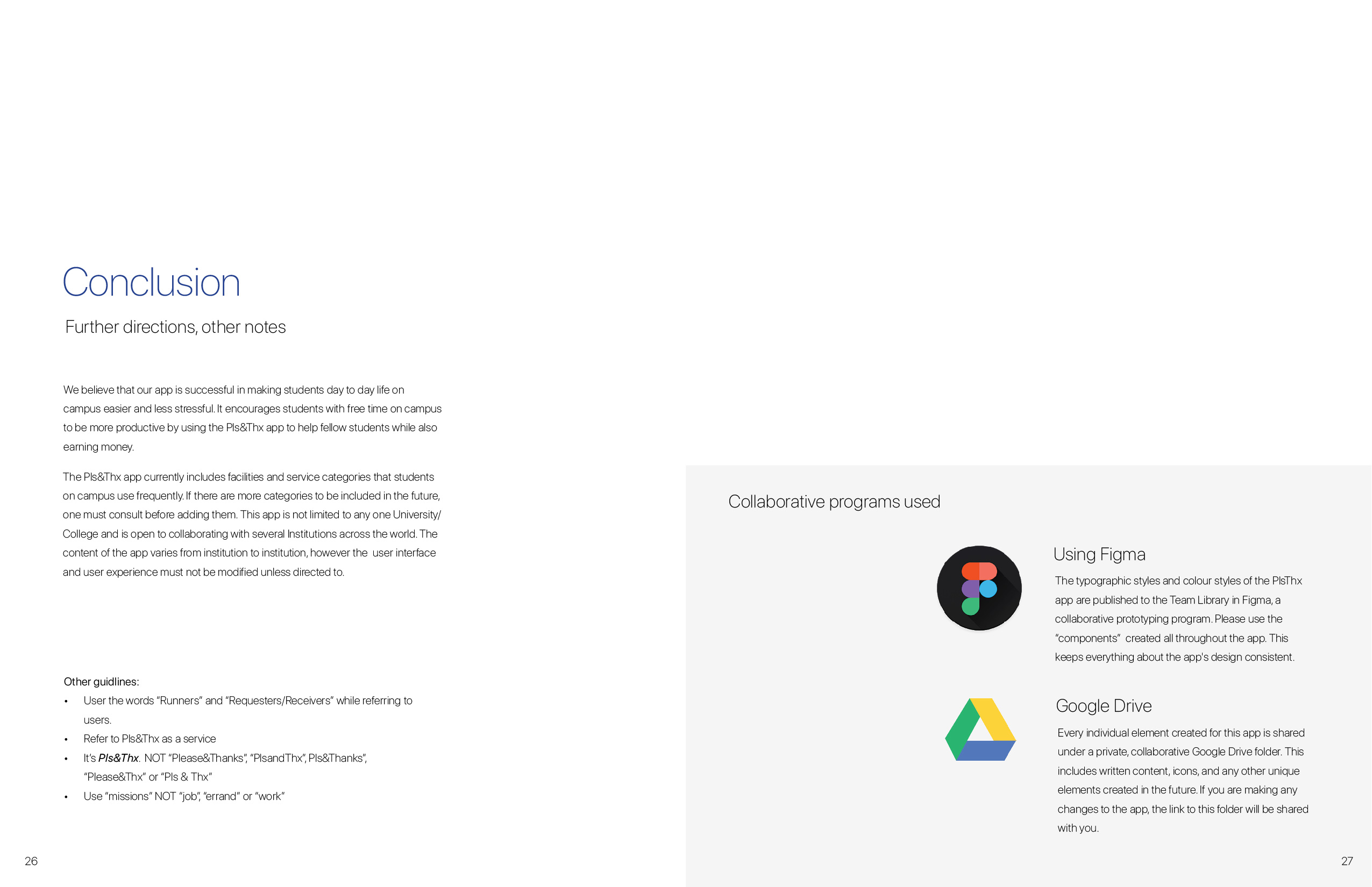
Project Tools used:
Figma, Sketch, Illustrator, InDesign, After Effects, Premiere Pro
From rushing to grab lunch in between classes, having to wait in long queues to printing essays and forgetting a charger on a far end of the campus, a students life is stressful. Most students find it difficult to manage their time and let’s be real, students are lazy. Wouldn’t it be great if someone brought a coffee to the desk or waited in line for a small fee, while submitting an essay at the very last minute? Pls&Thx, a mobile app aims to create a community of helping hands on campus, a service for students by students.
Many students have back to back classes with no time to grab lunch leading to an unhealthy and stressful lifestyle, while other students may have long breaks with not much to do.
Design Challenge:
How might we empower students to utilize their time and money on campus while increasing their productivity?
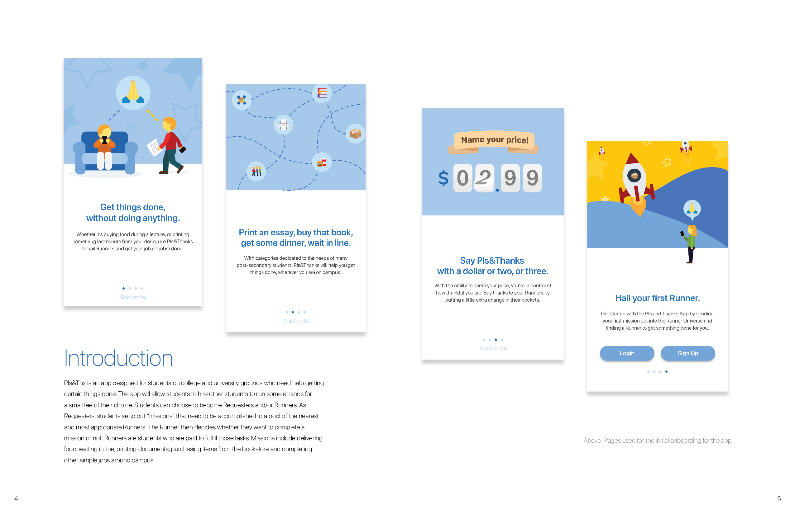
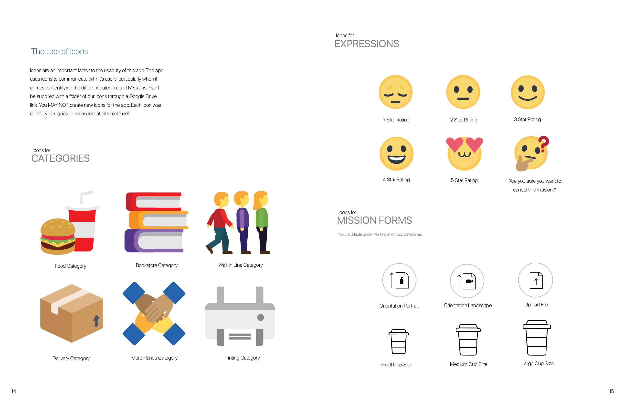
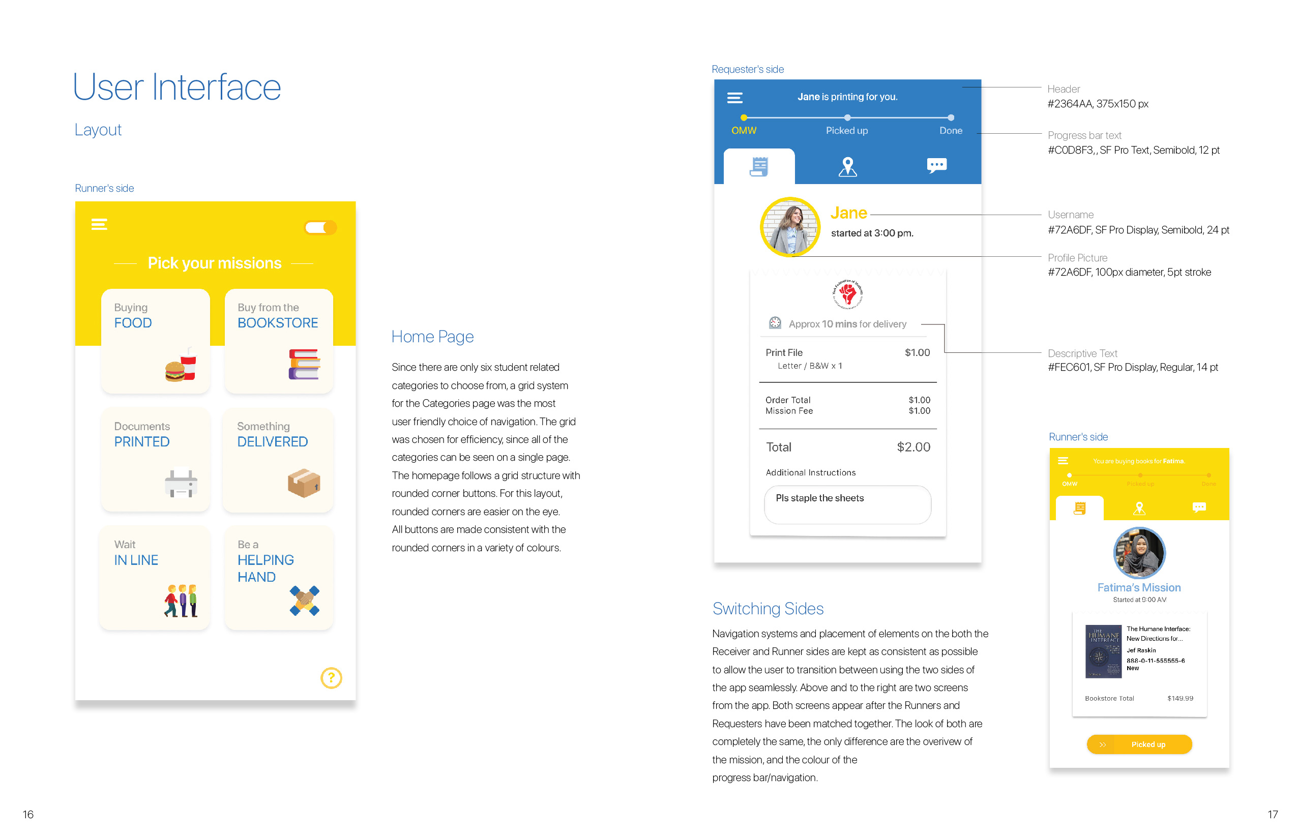
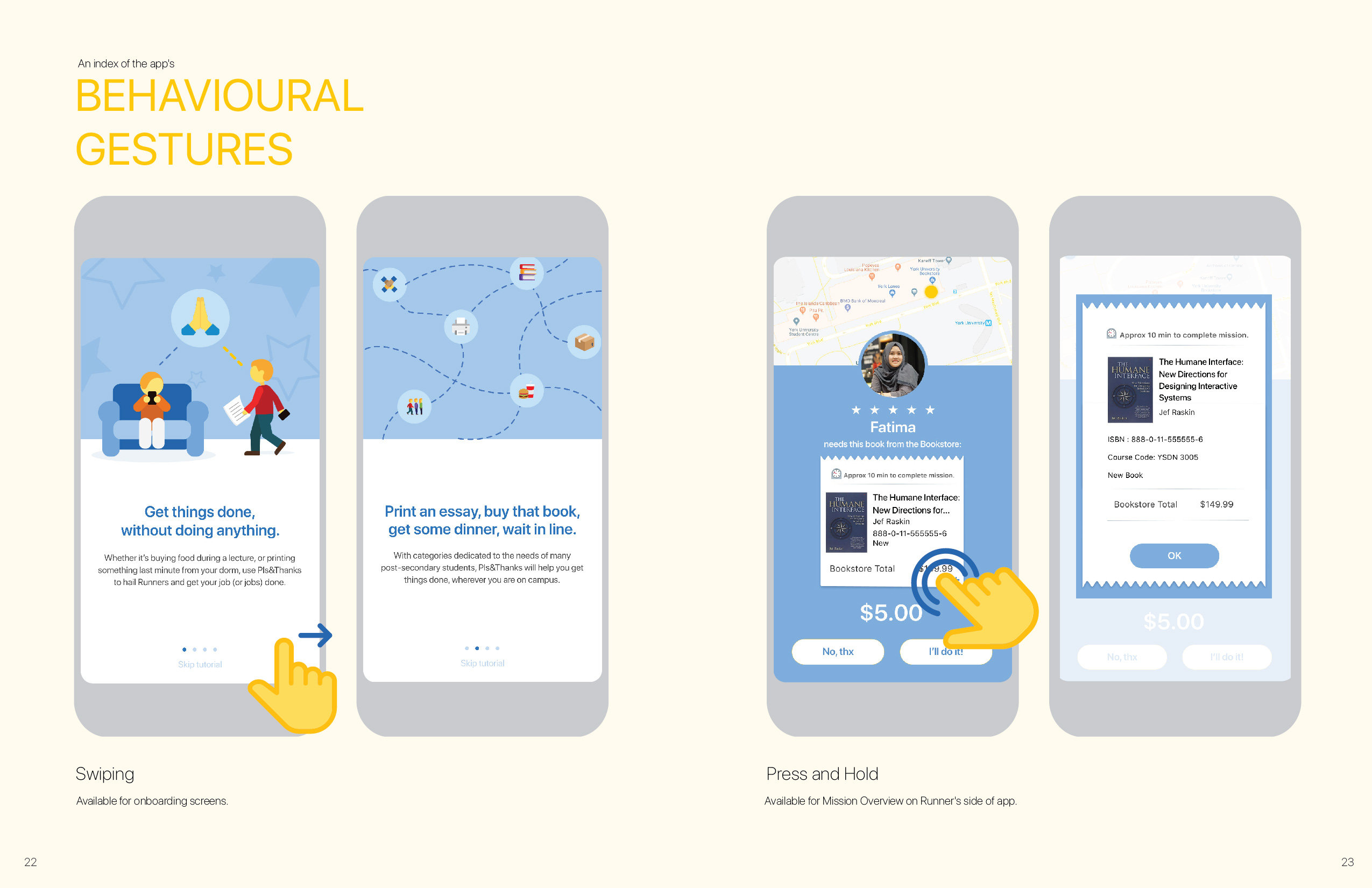
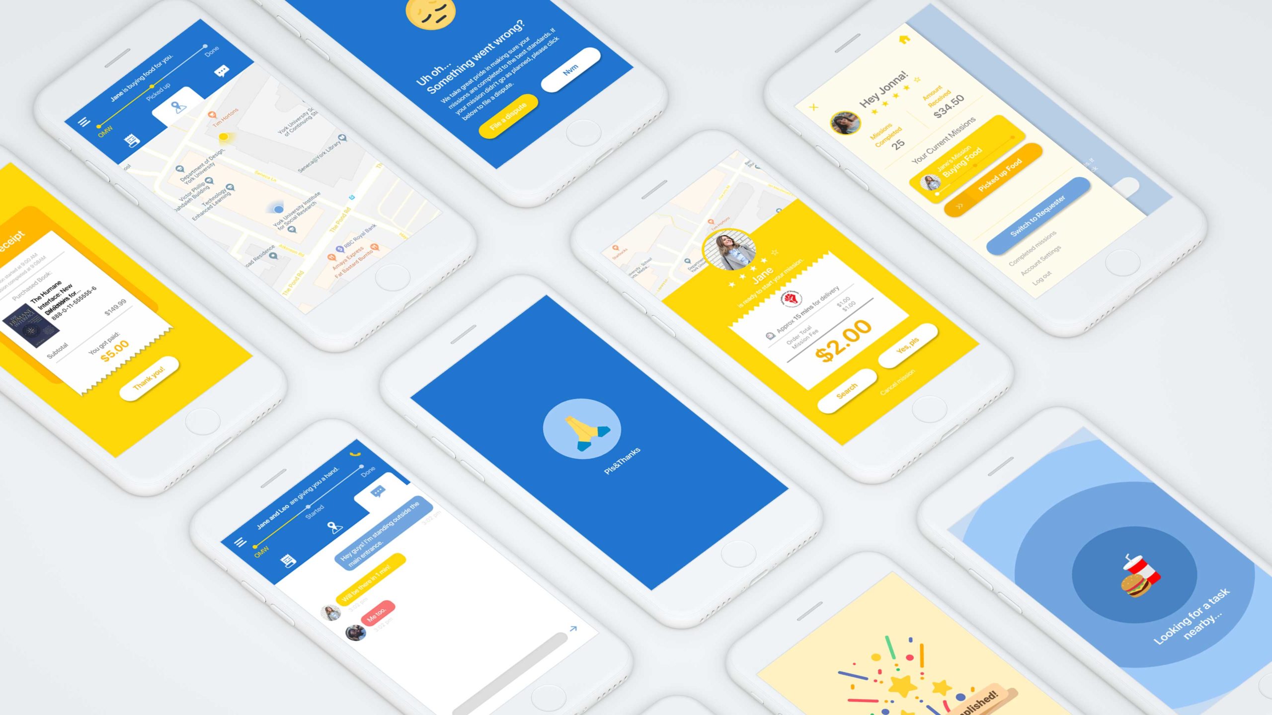
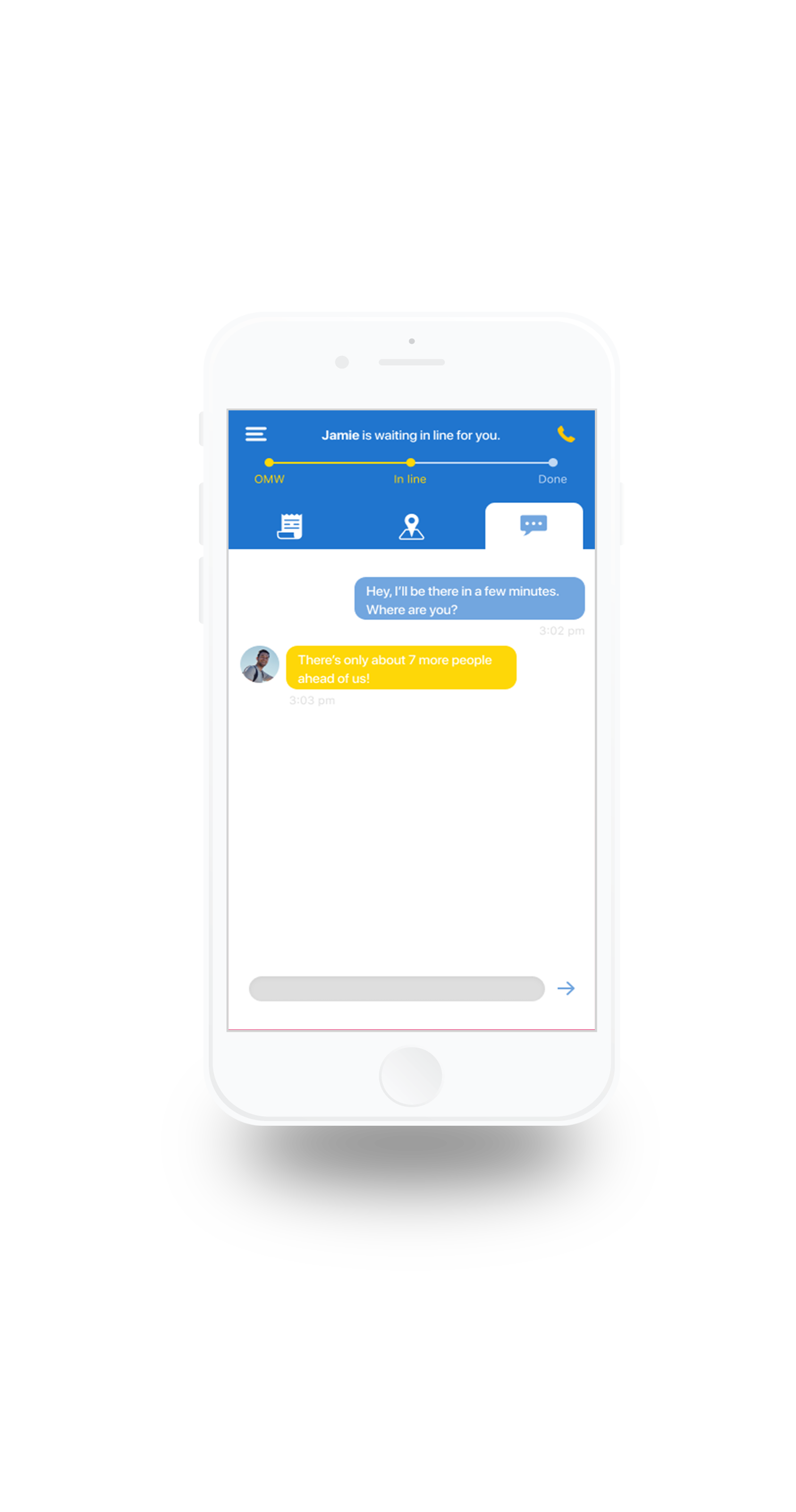
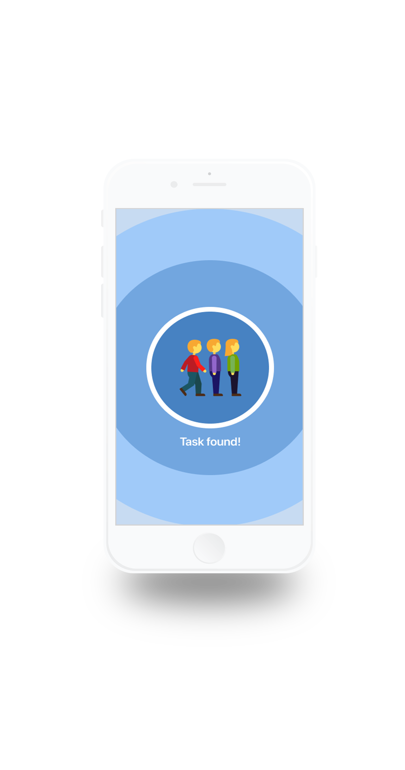
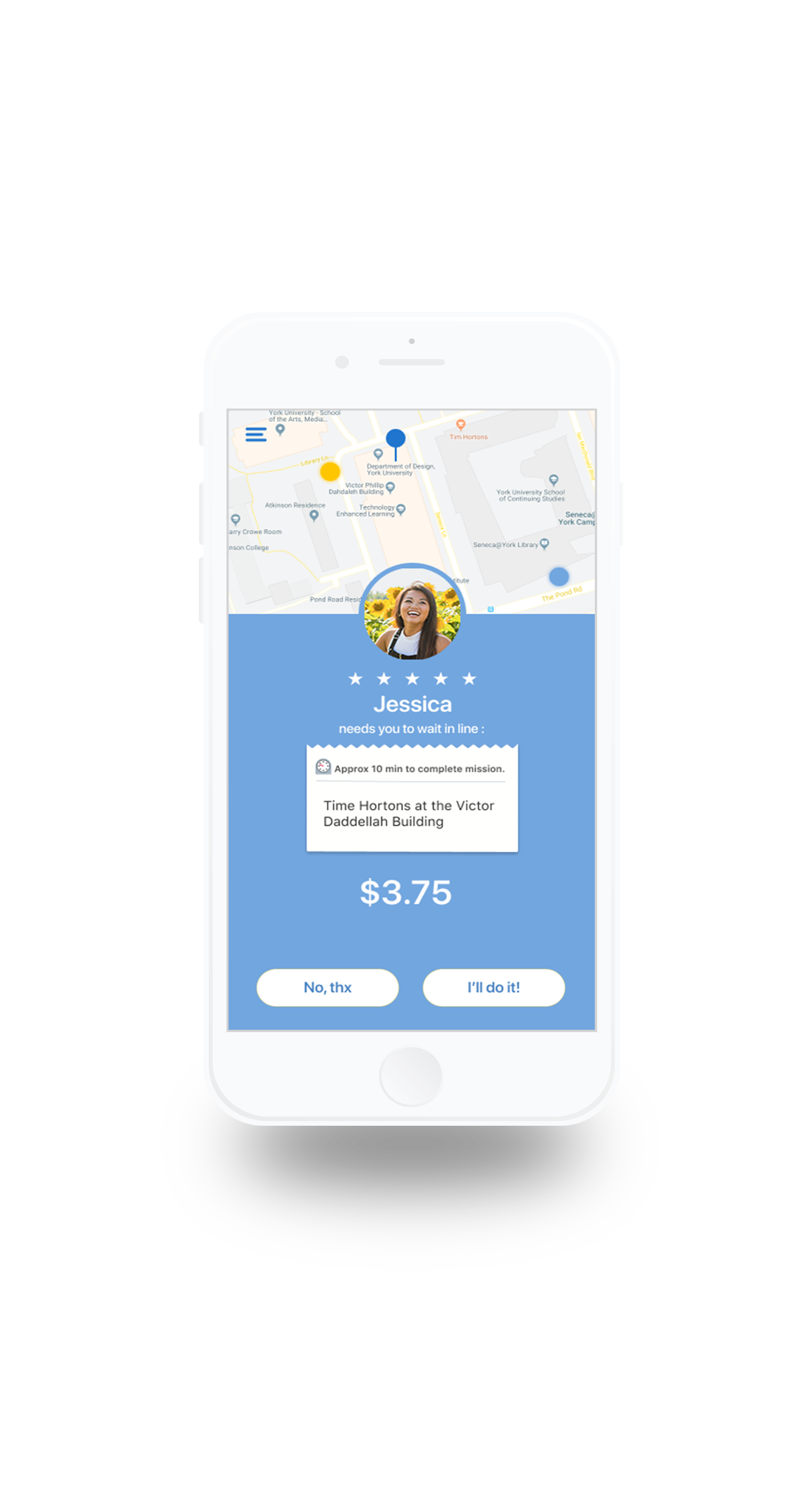
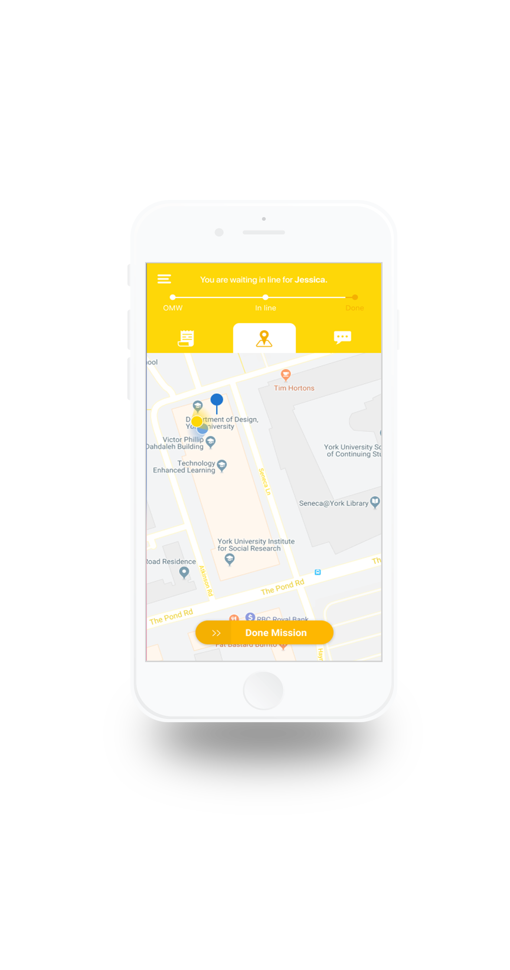
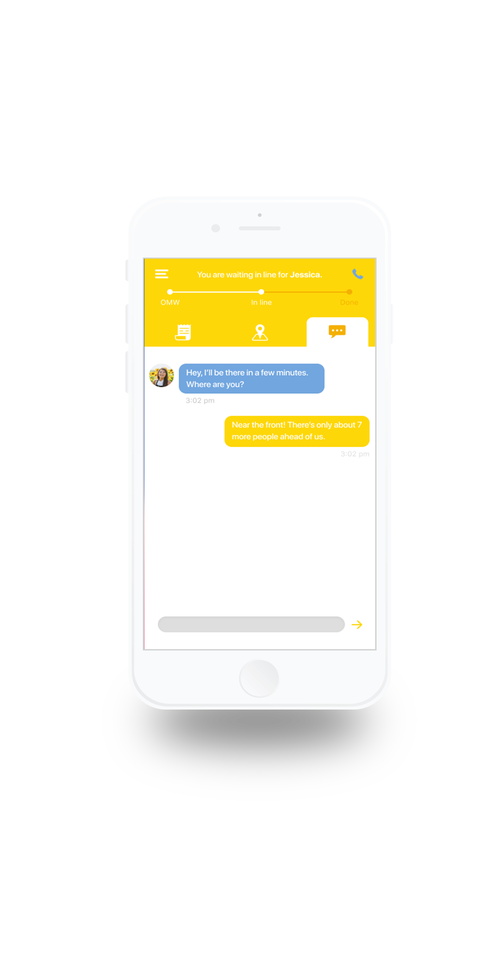
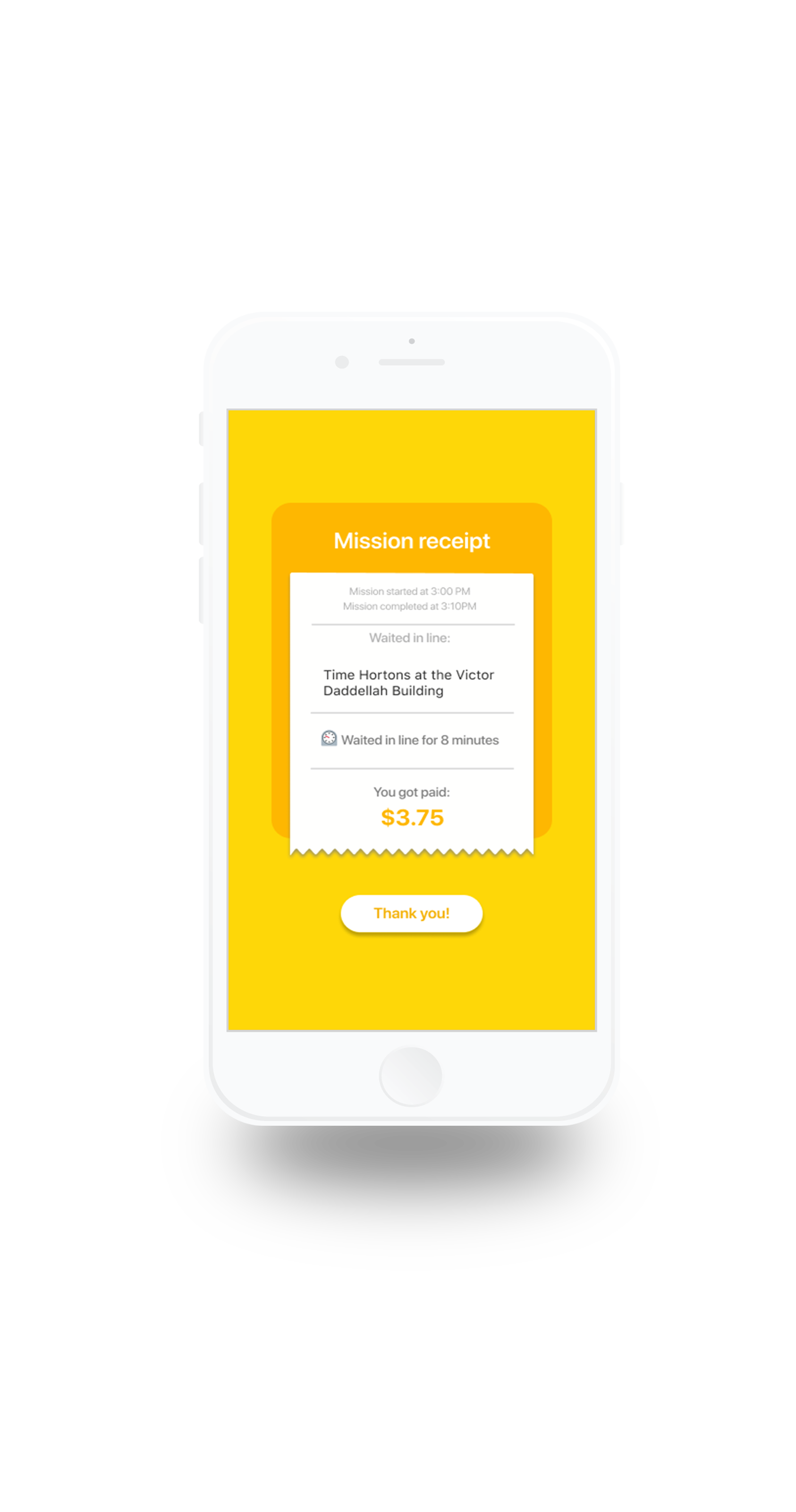
The Pls&Thx App is an app designed for students on college and university grounds who need help getting certain things done. The app allows students to hire other students to run some errands for a small fee of their choice. Students can choose to become Requesters and/or Runners. As Requesters, students send out missions that need to be accomplished to a pool of the nearest and most appropriate Runners. The Runner then decides whether they want to complete a mission or not. Runners are students who are paid to fulfill those tasks. Missions include delivering food, waiting in line, printing documents, purchasing items from the bookstore and completing other simple jobs around campus.
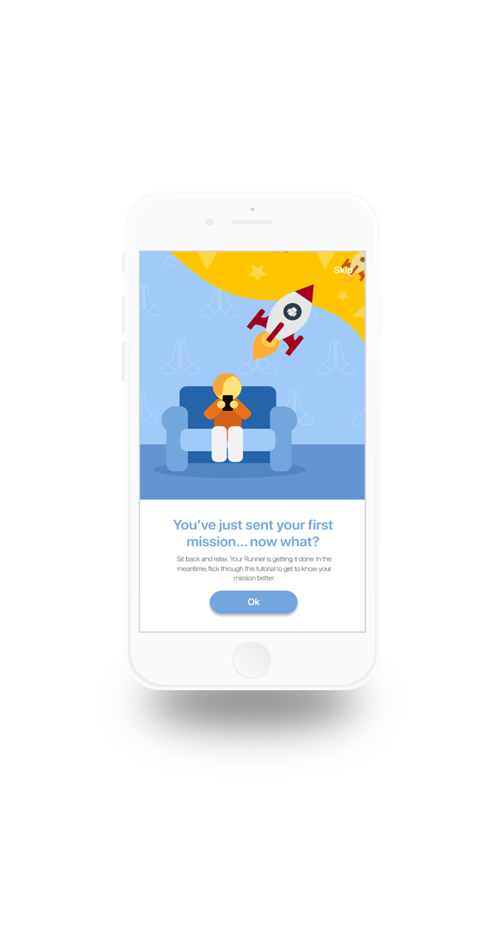
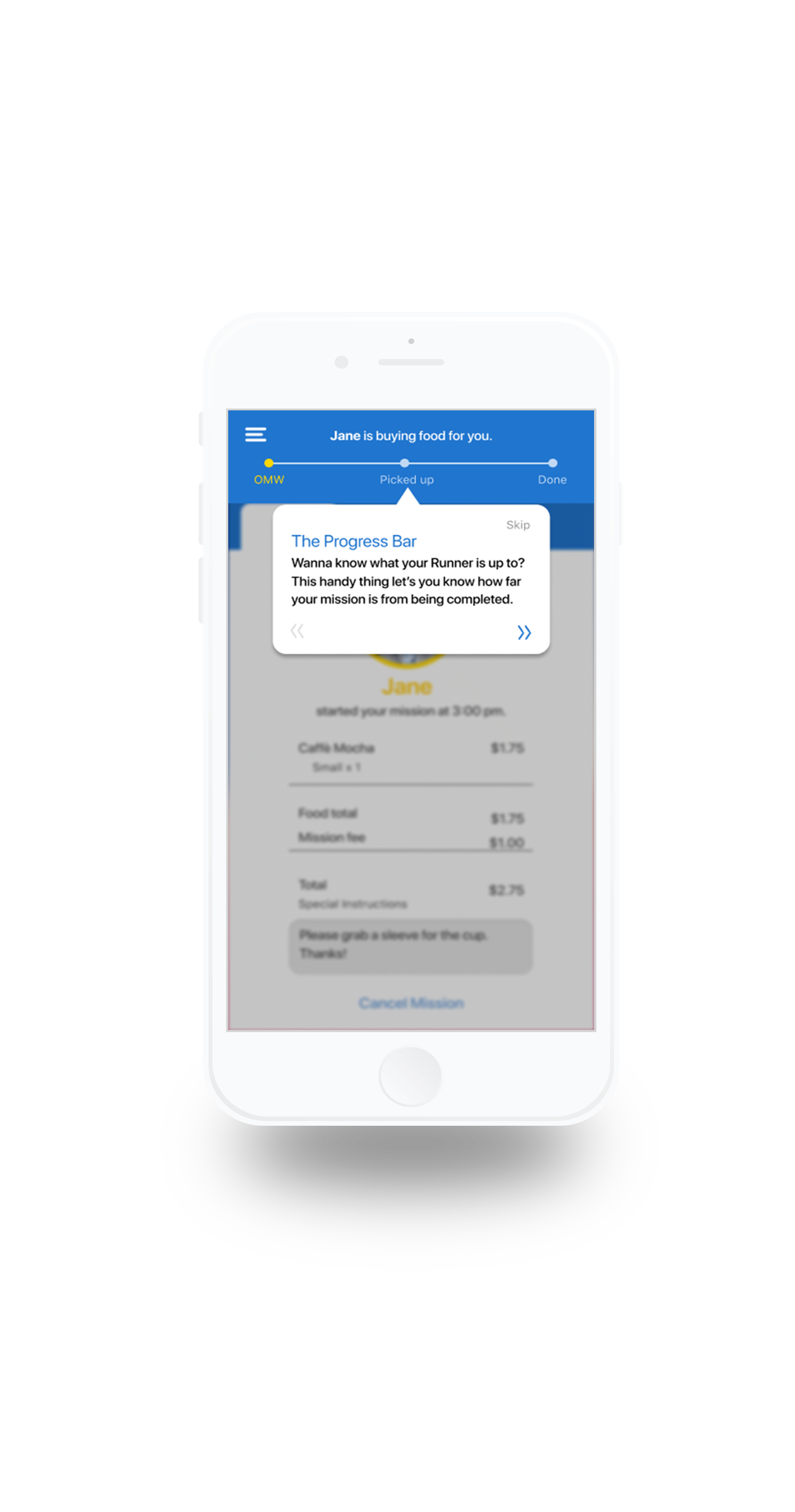
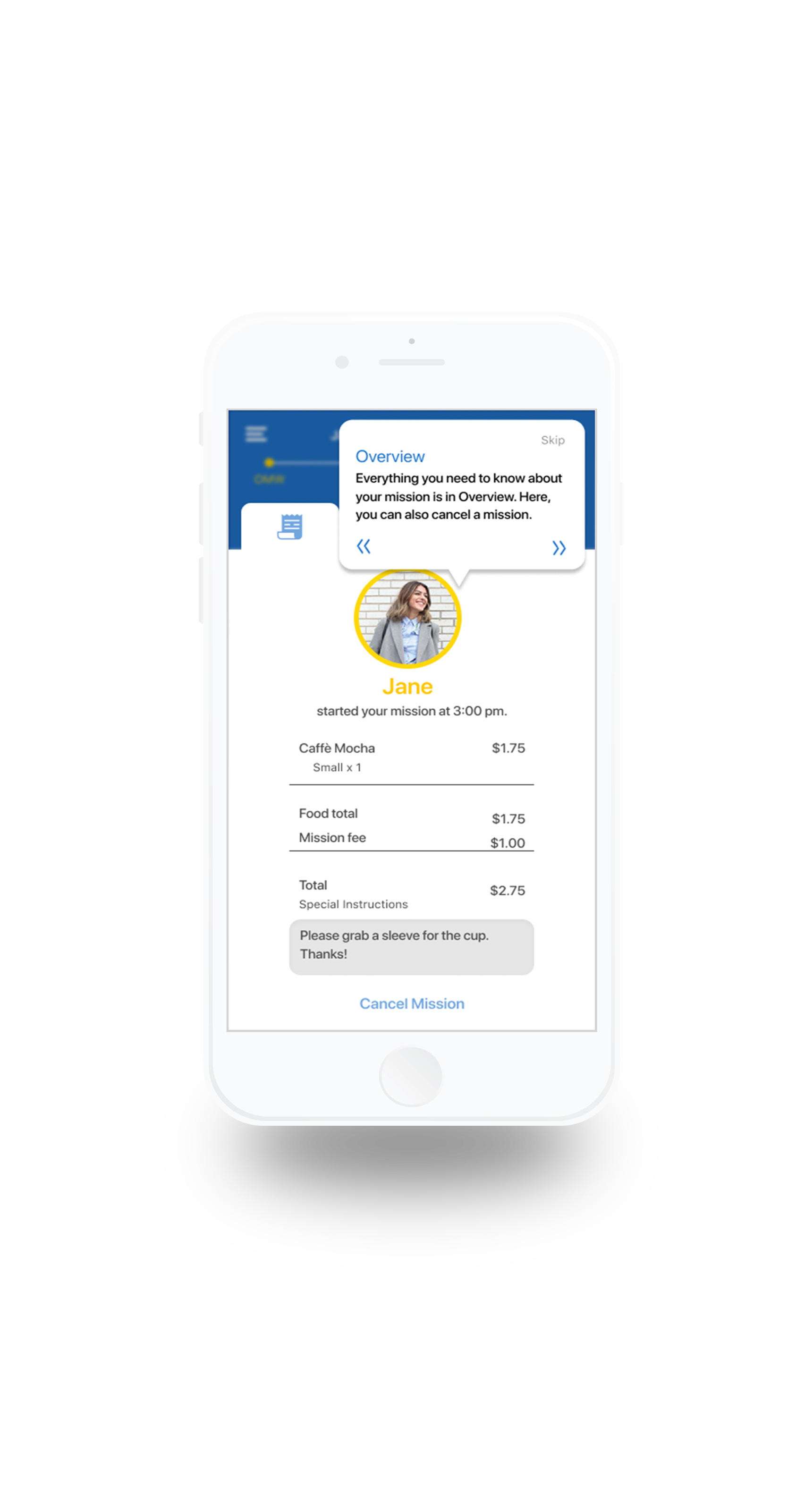
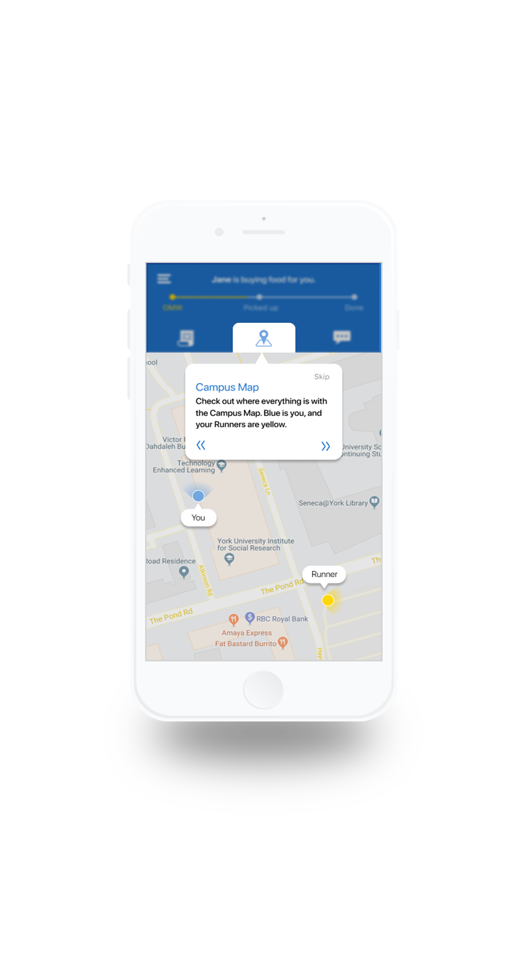
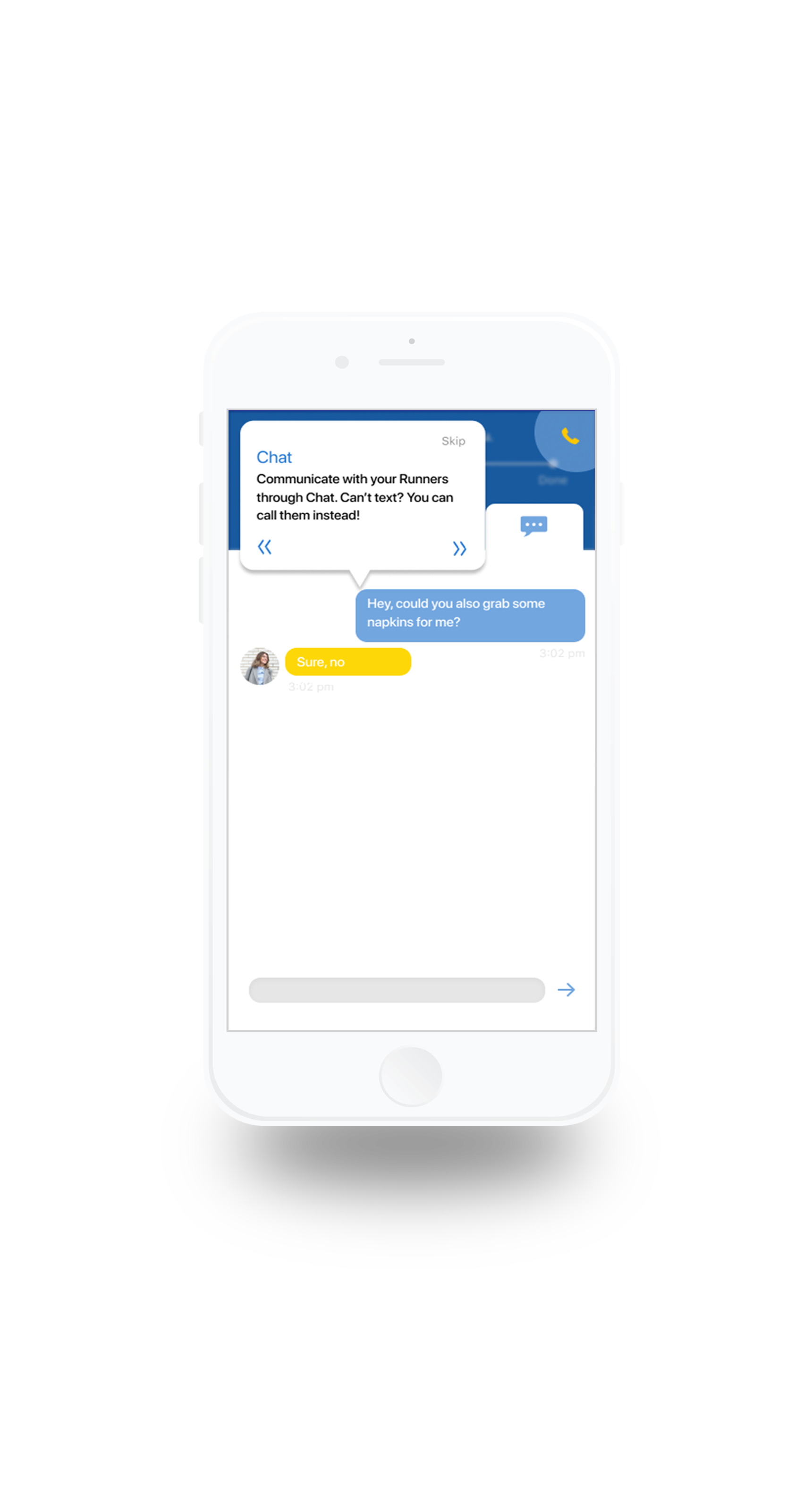
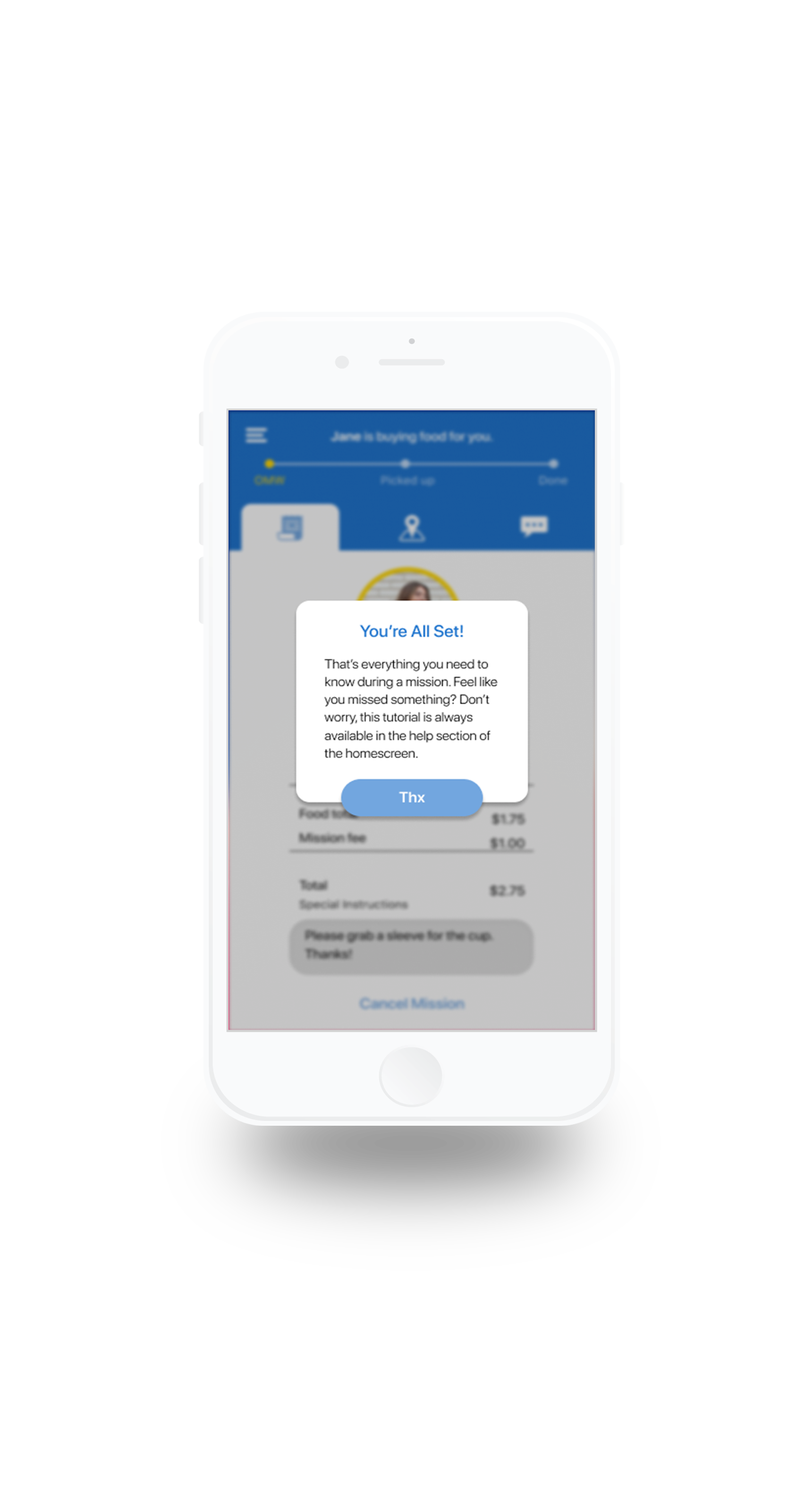
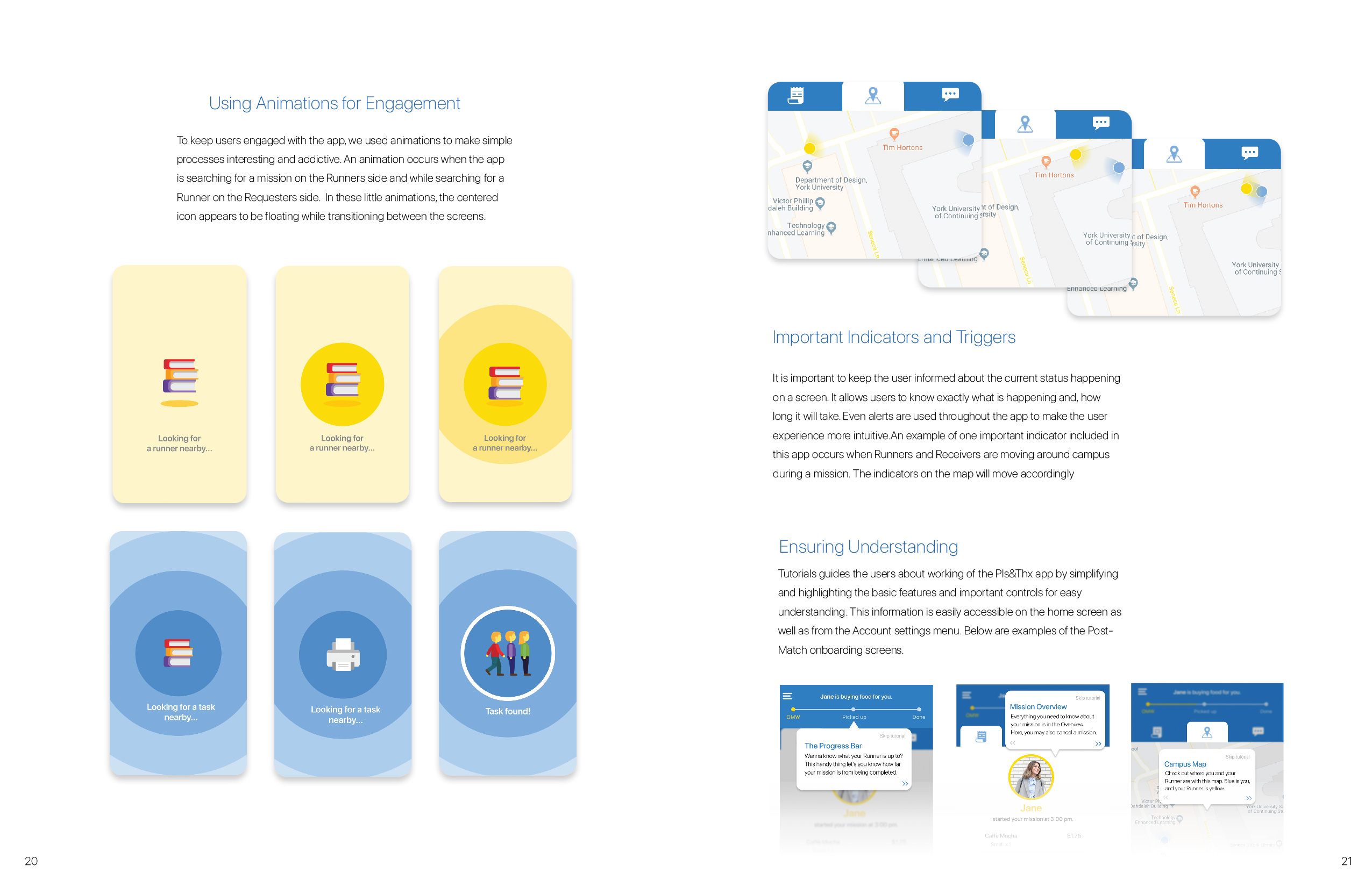
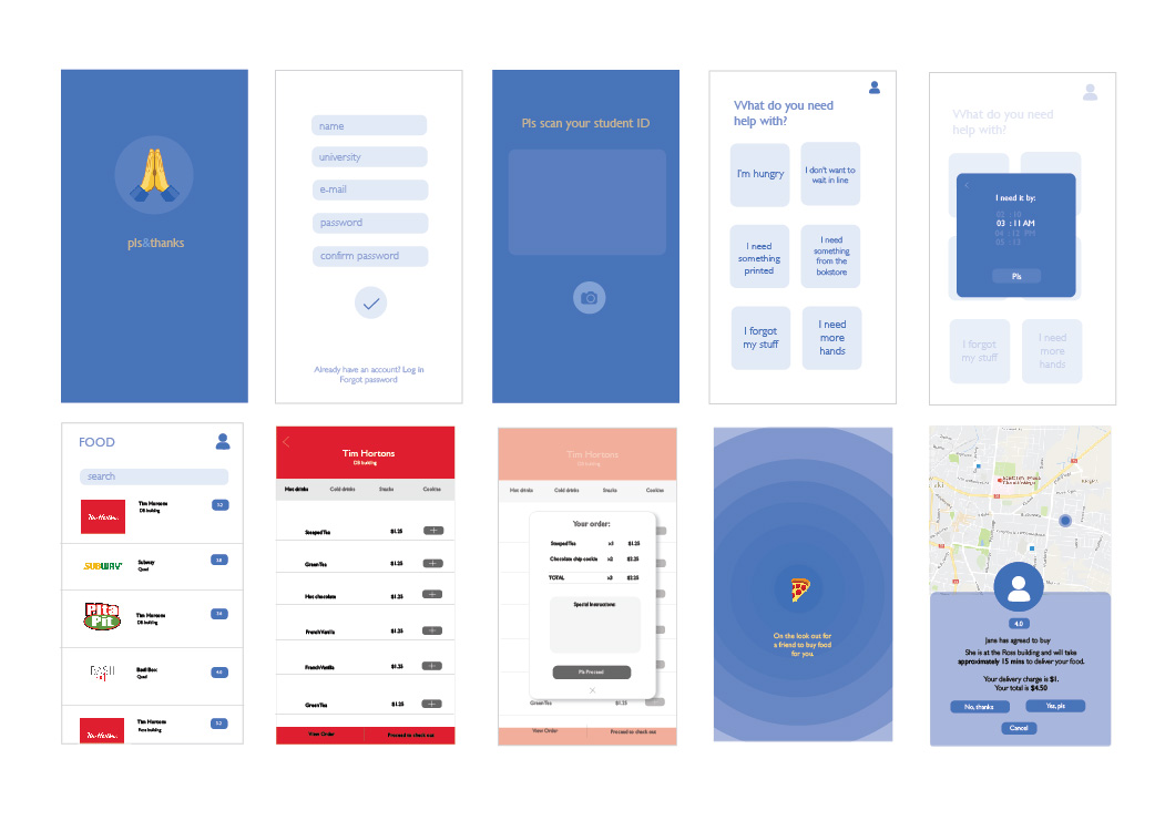
Post match user on-boarding
A quick and short onboarding eliminates chances of confusion and frustration by thoroughly going through each function of the Pls&Thx app.
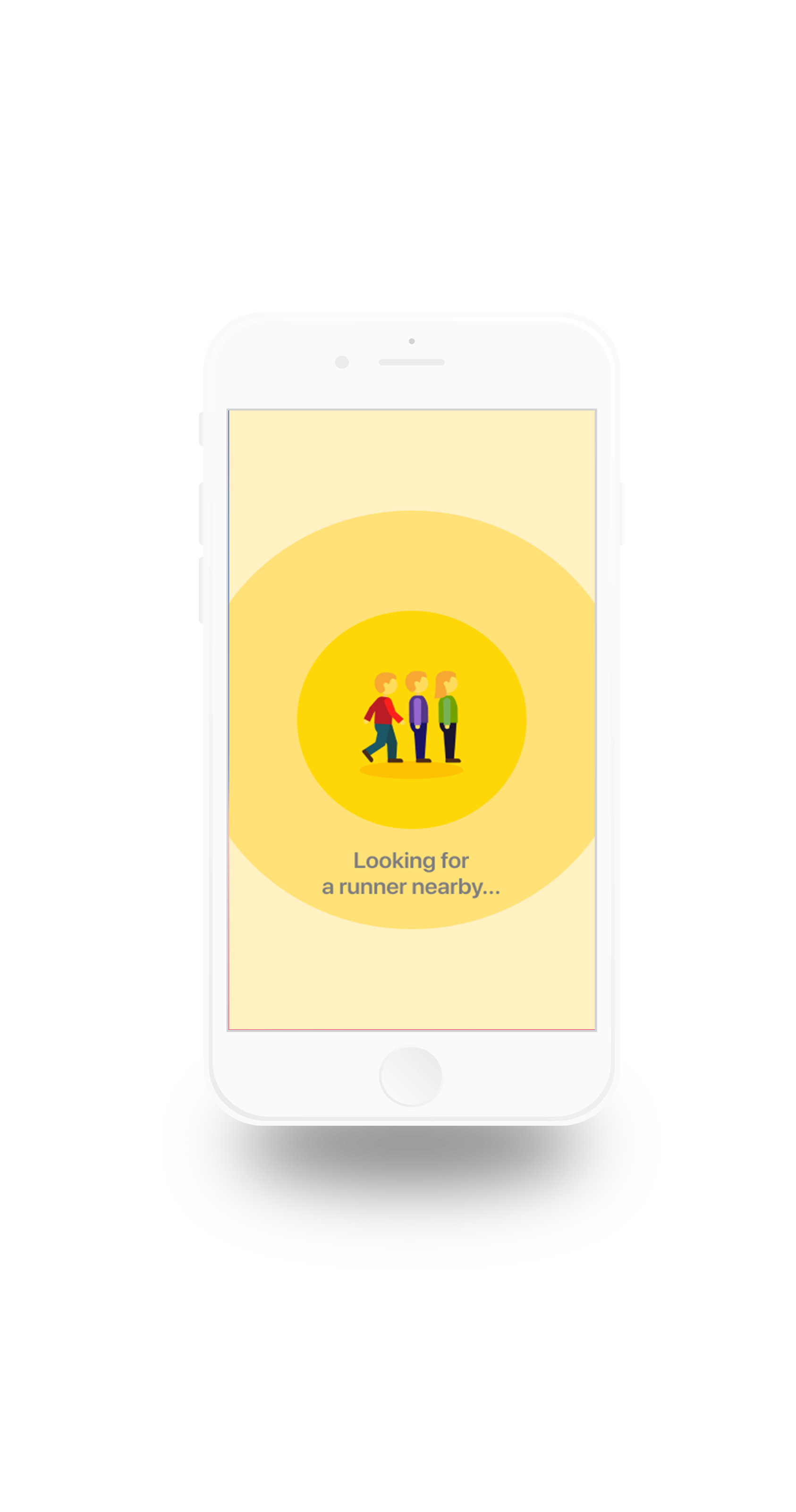
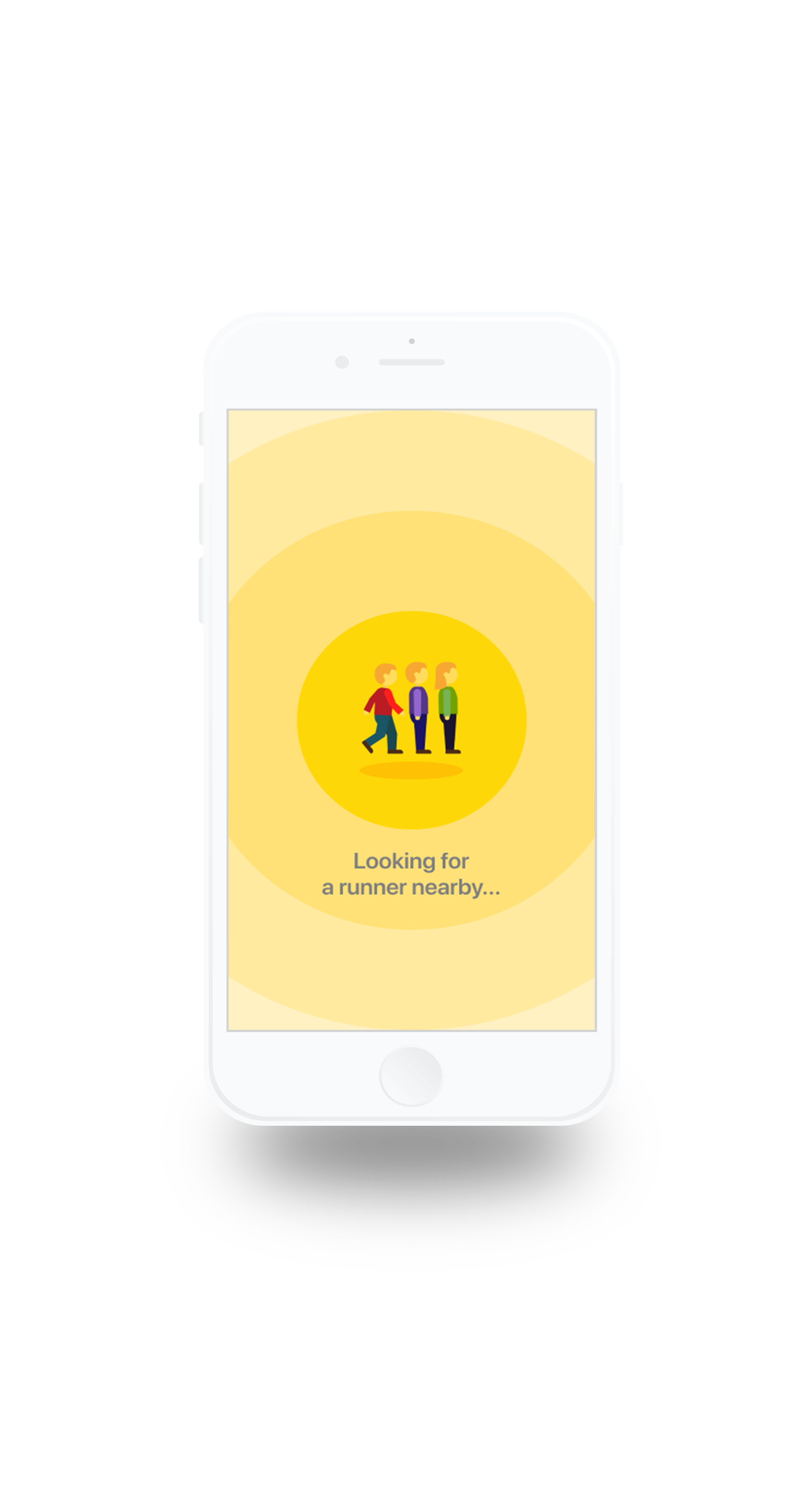
Choose to be of help or find help
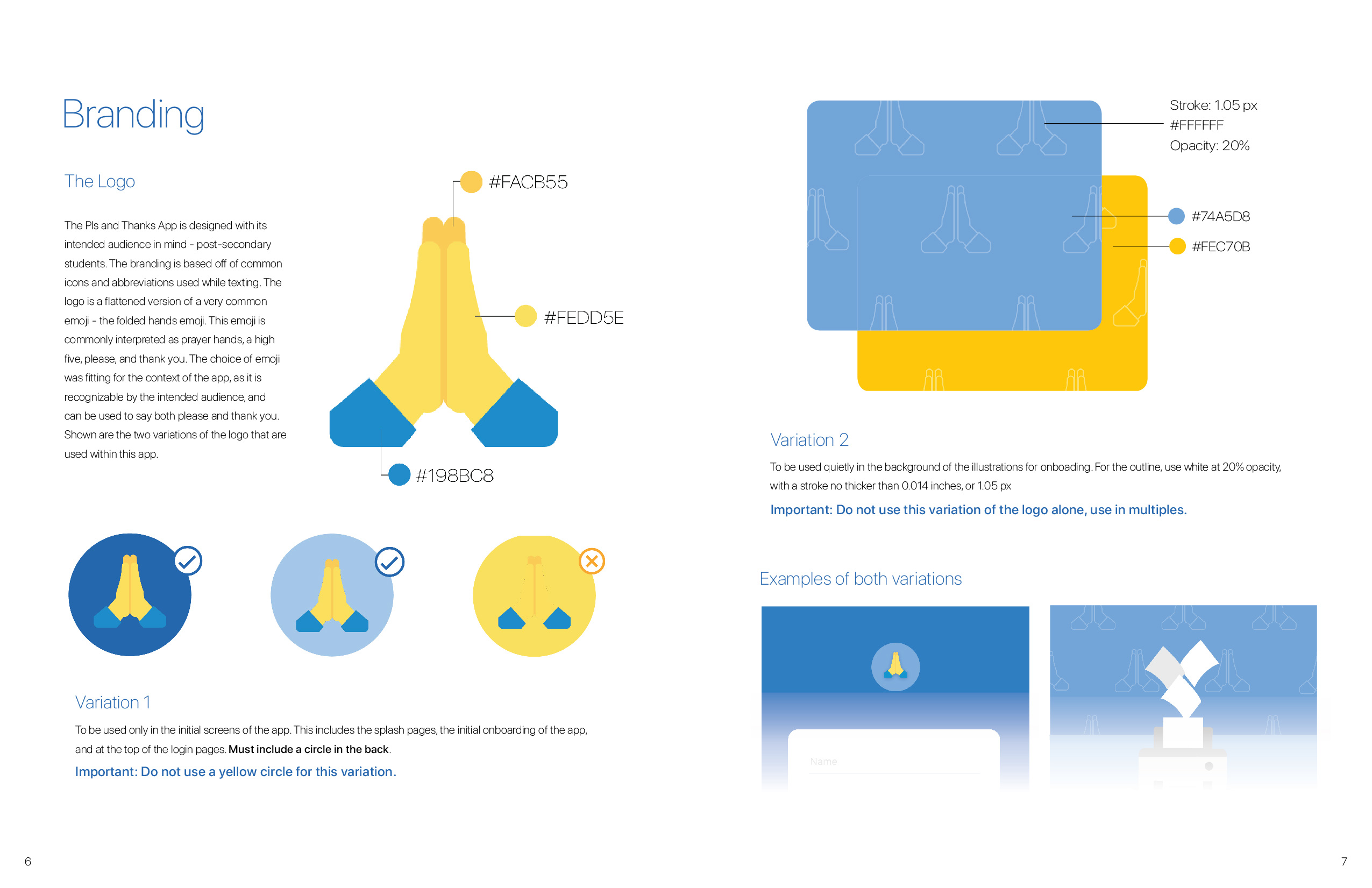
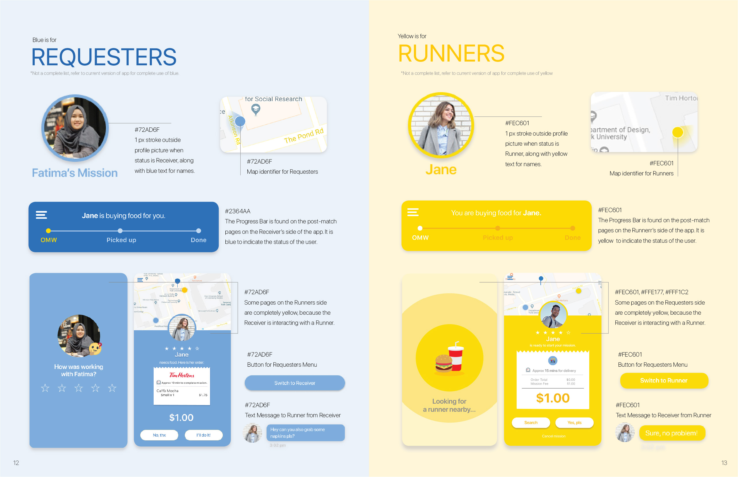
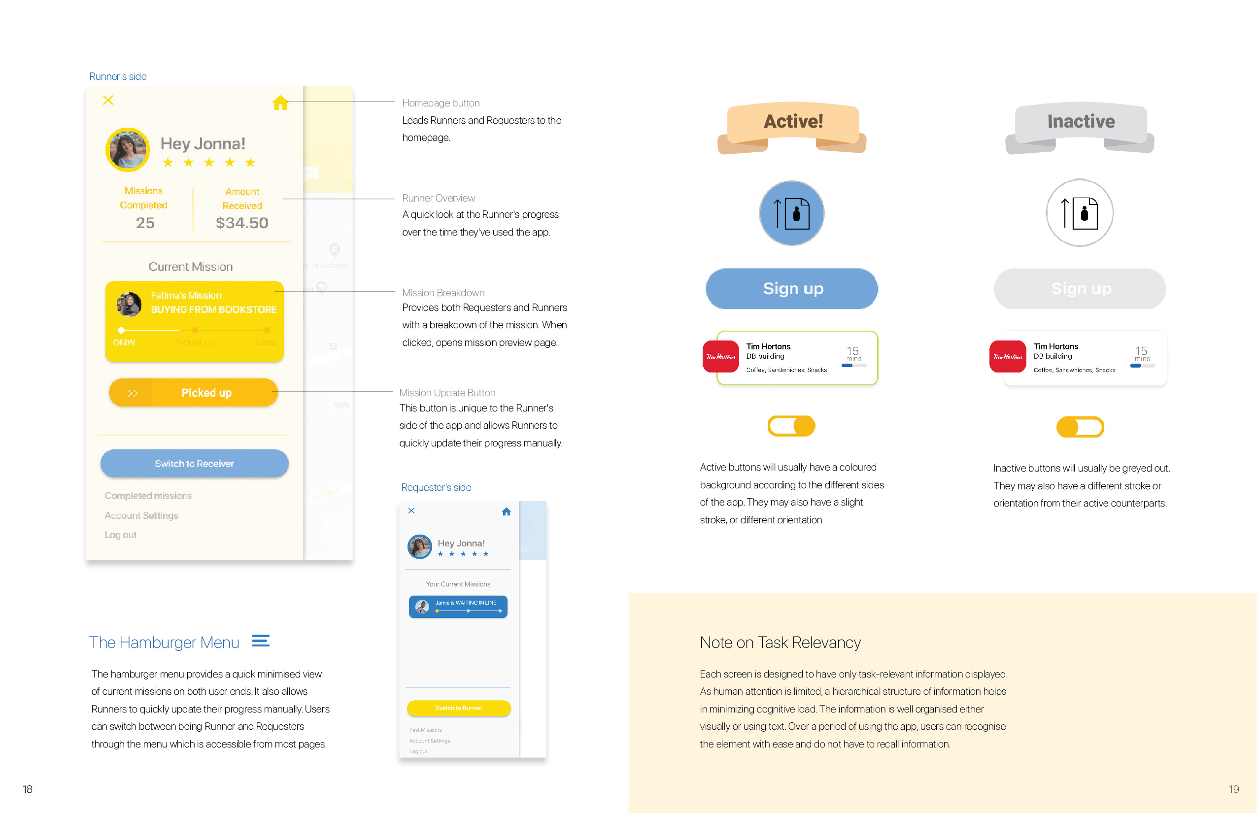
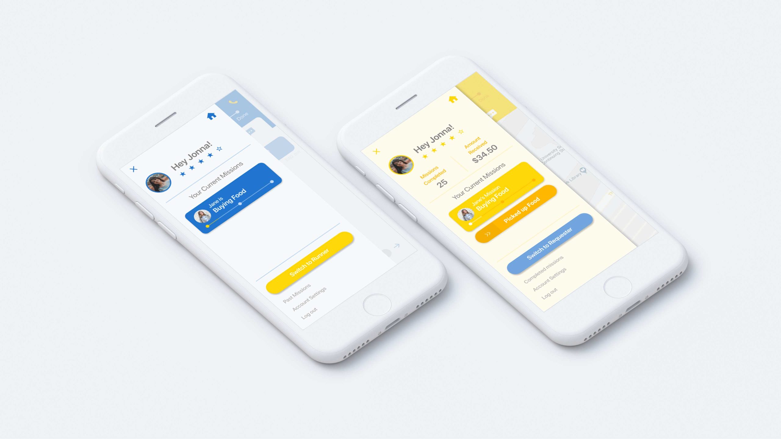
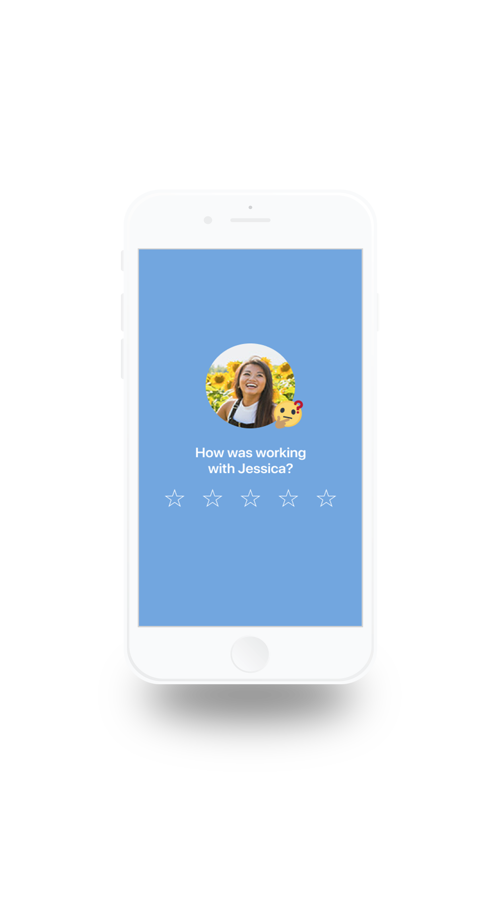
Using colour to distinguish between a Runner and a Reciever through out the app. Yellow is for Runners and Blue is for Requesters.
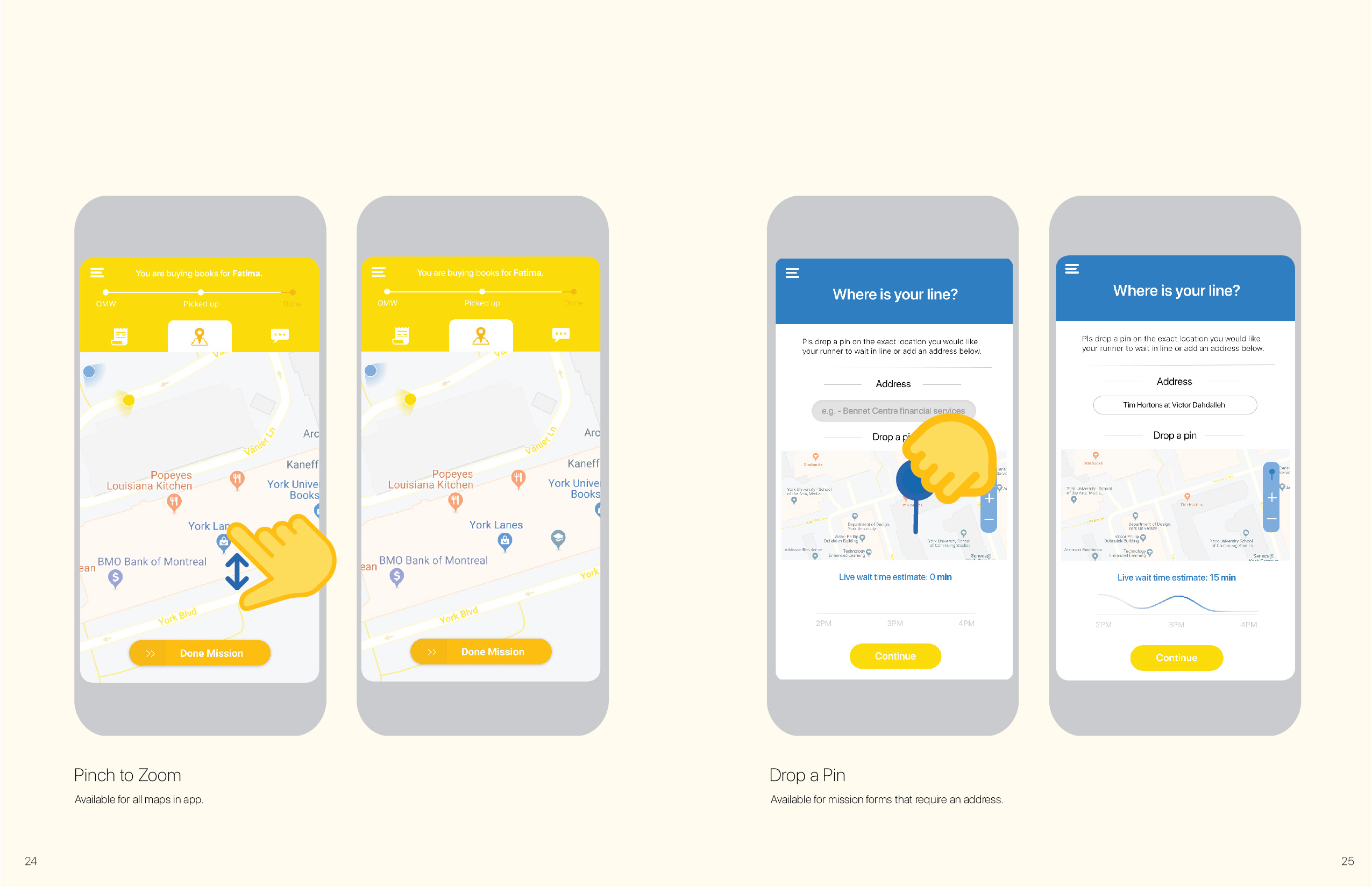
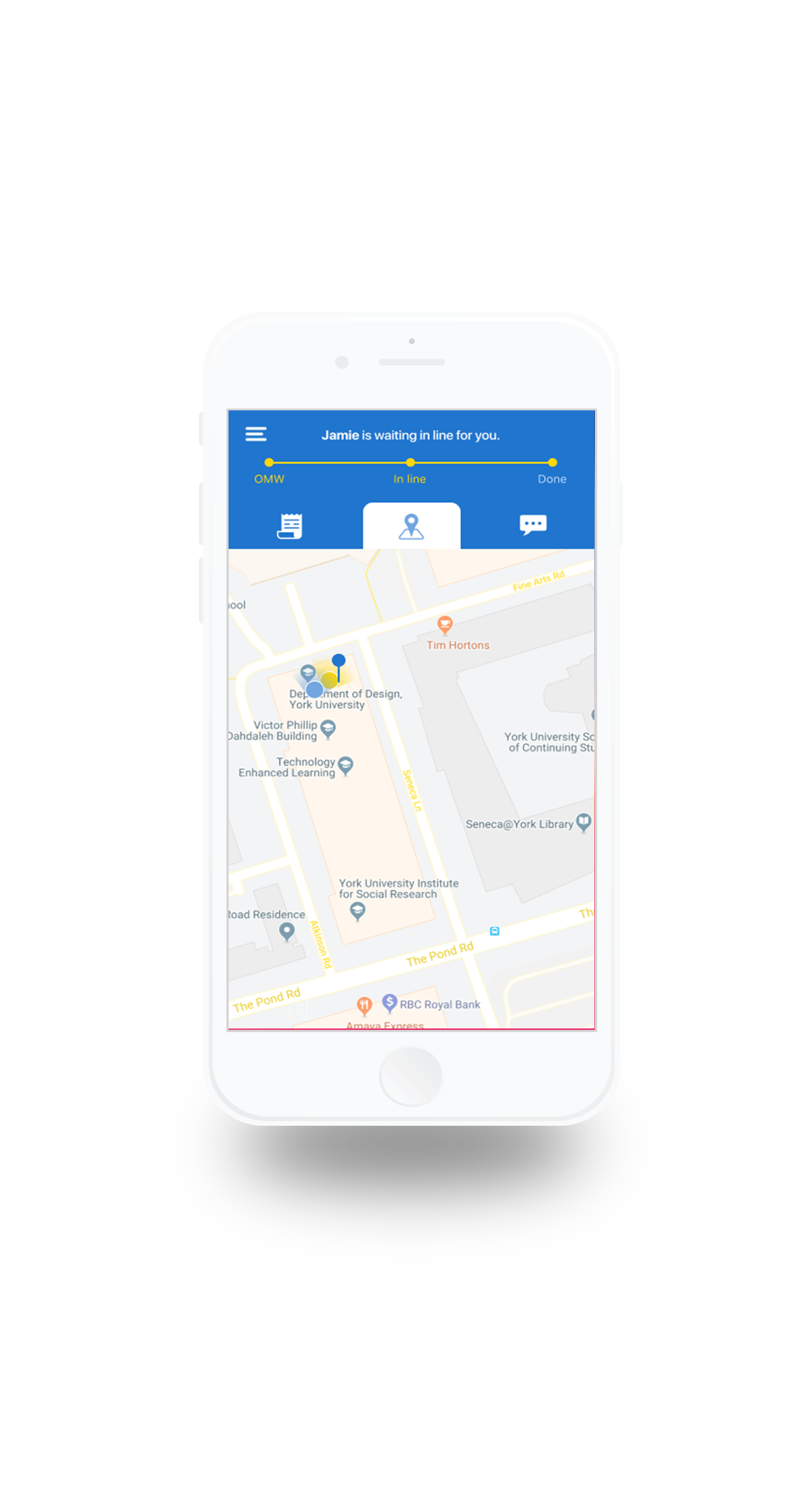
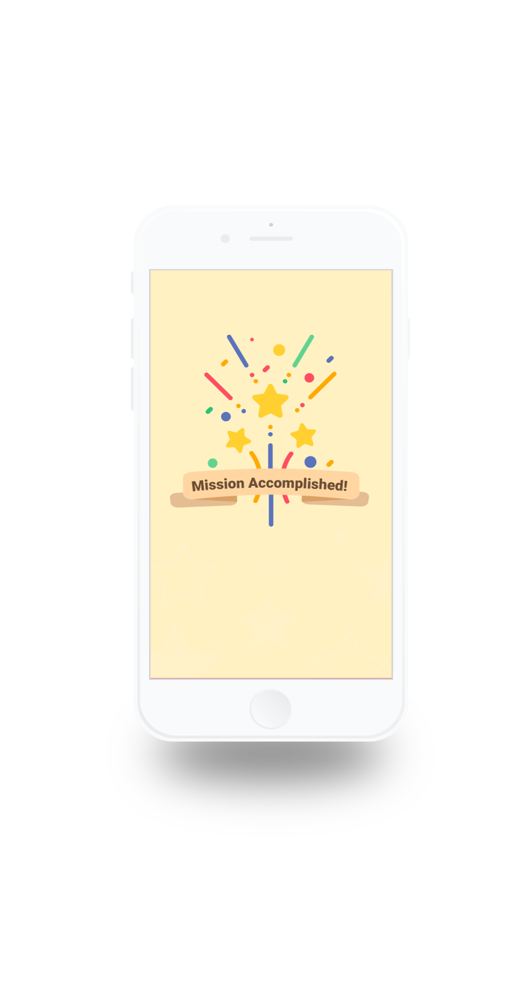
A pay-what-you-can service that can be tracked in real time through a easily accessible tracking bar in the menu.


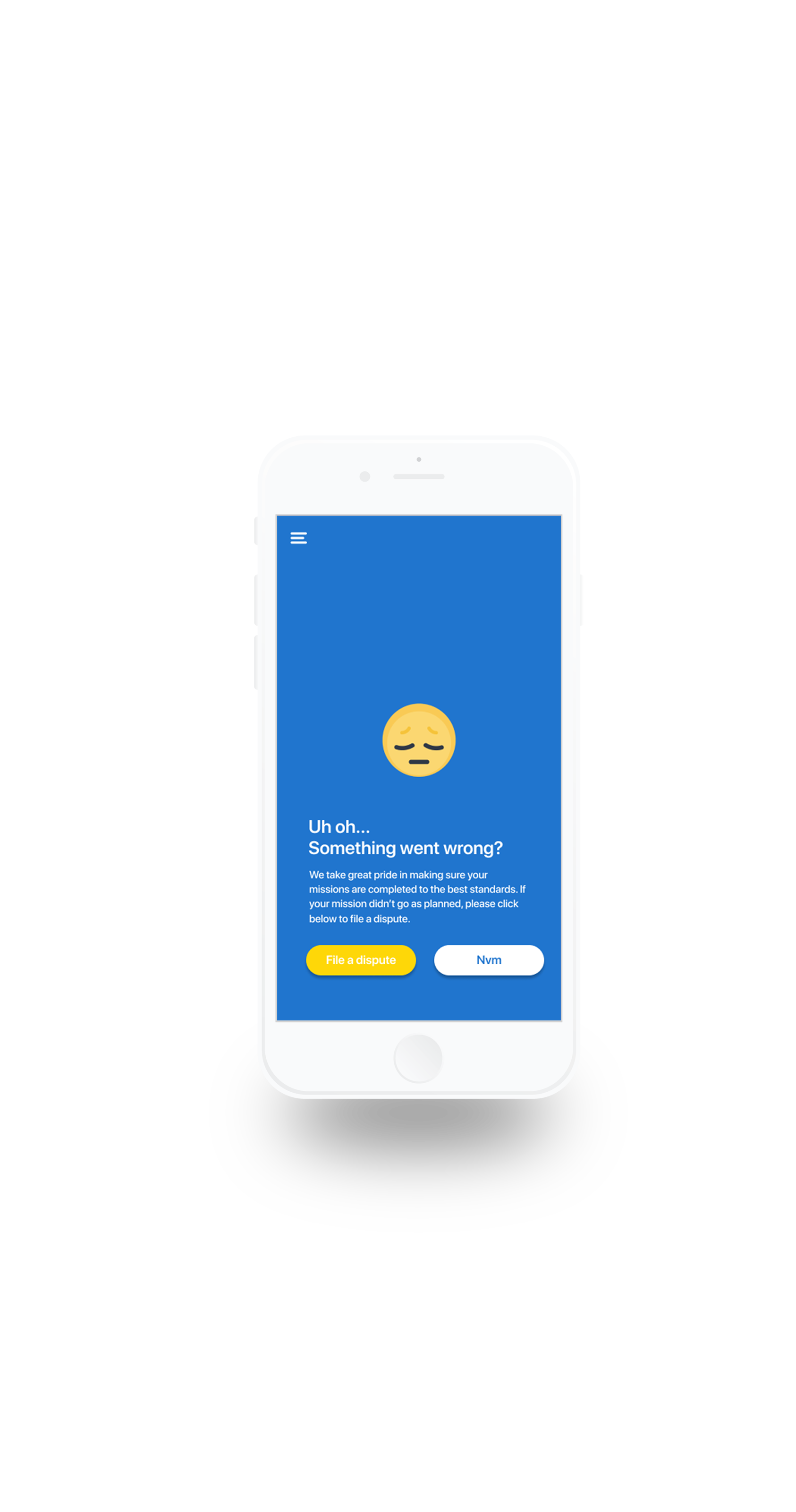
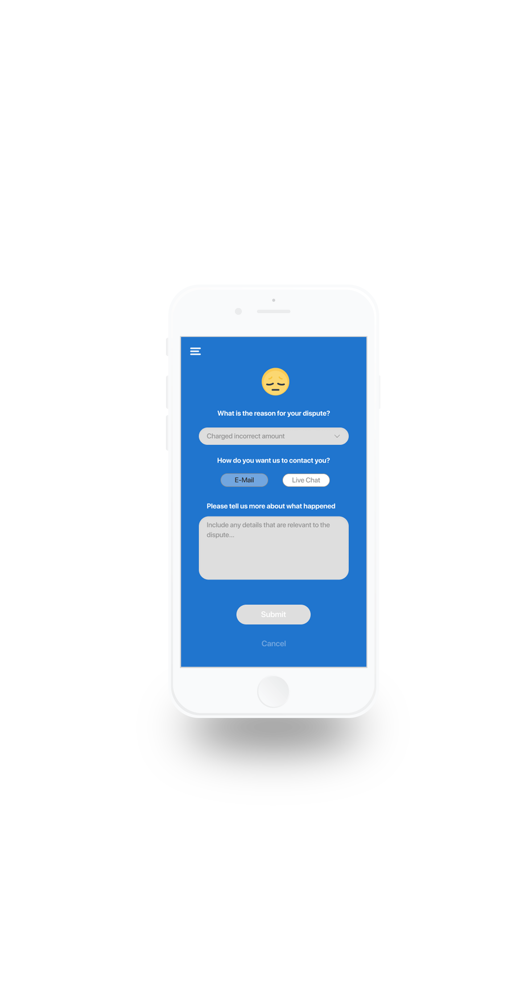
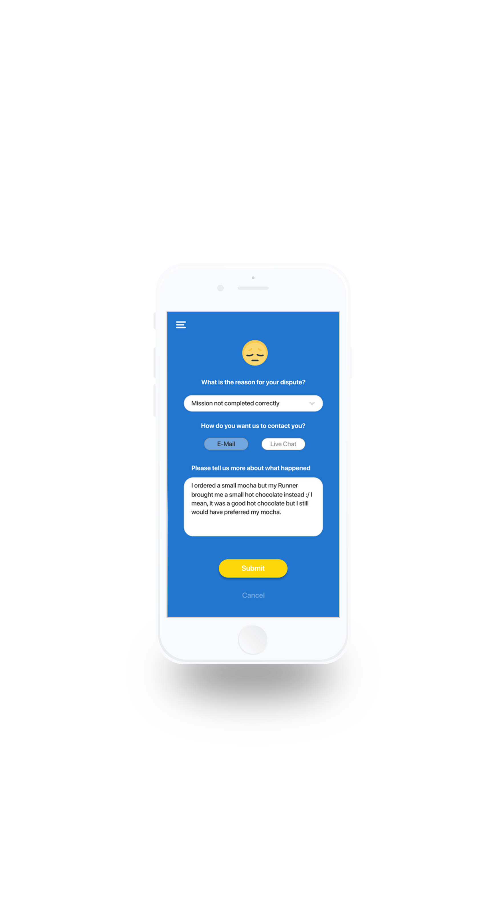
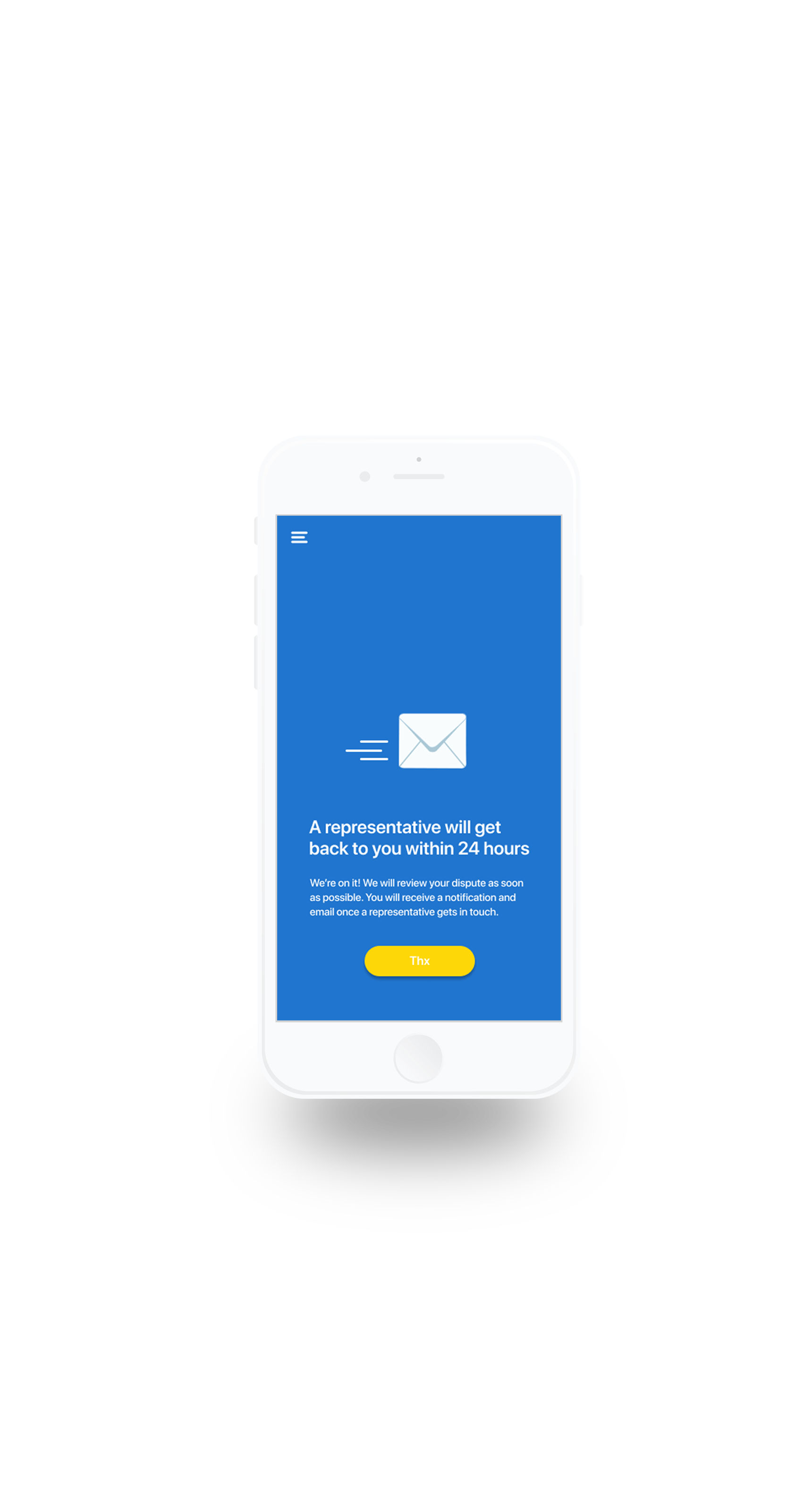
Filing a dispute for a mission gone wrong
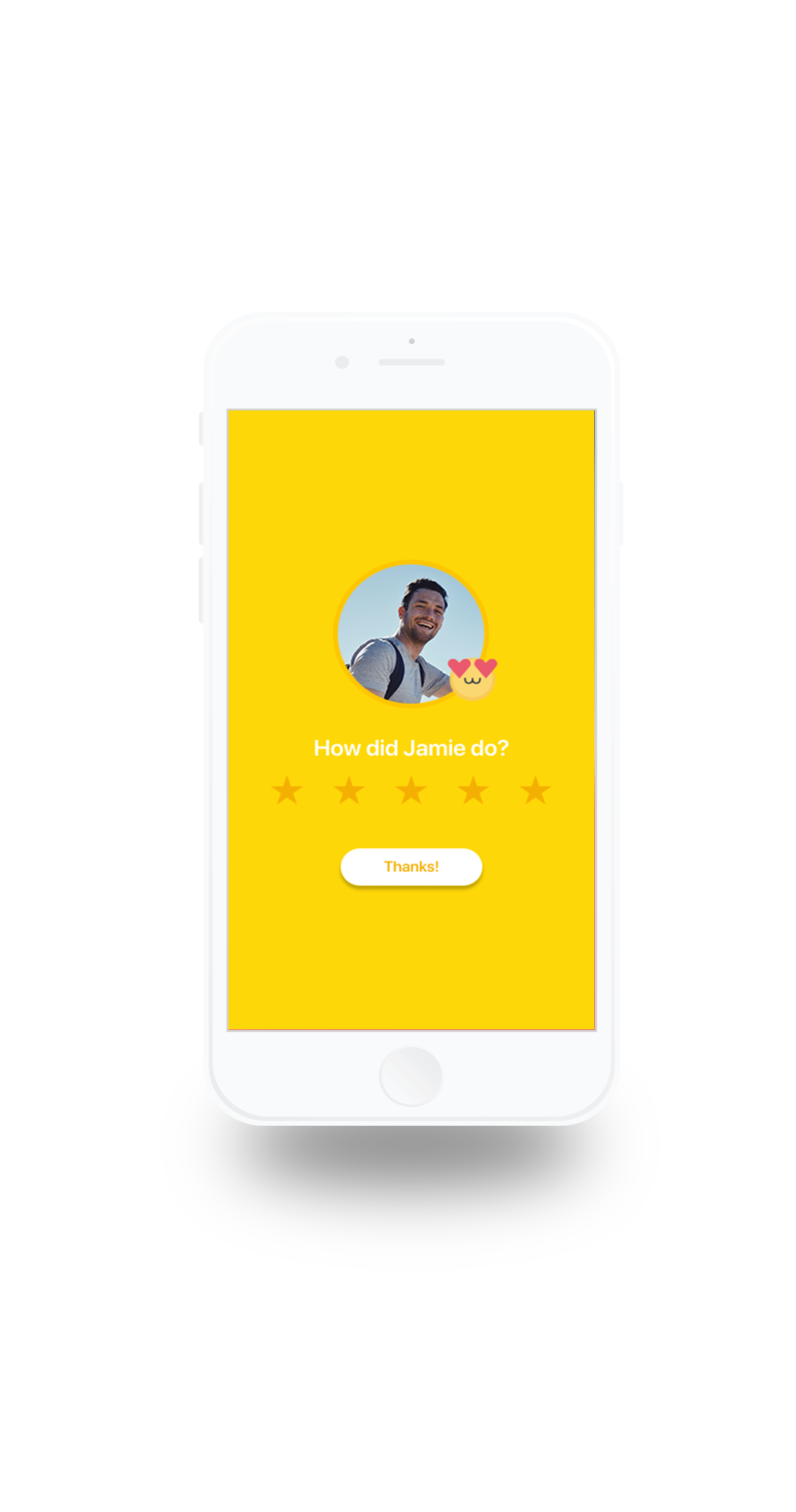
Making users satisfaction a priority, a dispute form is included in the app. When a mission goes wrong, users can file a dispute explaining the problem and a representative will contact them within 24hrs.
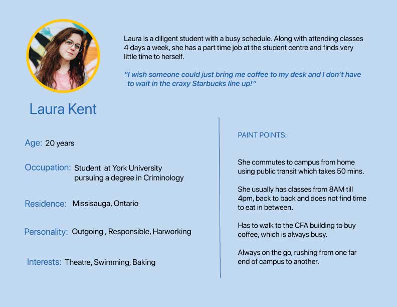
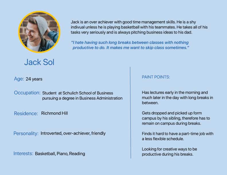
User Persona
Prior to making any significant design decisions for the app, it was important to determine who the target audience would be and what are their requirements. In-depth research was conducted throughout the building of the app with constant iterations and re-iterations.
Benchmark Analysis
Examining existing services with similar concepts provided guidance on how we could implement certain features and allowed us to understand what needs were not being fulfilled and how we could accomplish that through our app.
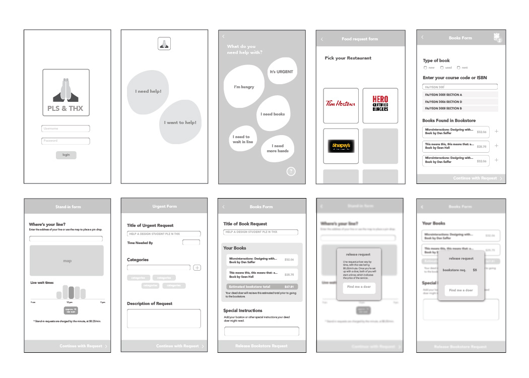
Wireframing
Creating low-fidelity and mid-fidelity wireframes allowing us to sucessfully user test the initial prototype of the app.
User Testing Procedure
We tested Pls&Thx on 5 University students from different programs.
Quick and Dirty Method: Showing participants key screens to determine if they can easily identify the functions and navigations of the app.
Role Playing: Participants carry out tasks as if they were a Receiver and Runner, including sending out a mission, completing a mission, and opening a dispute.
SD Rating Scale: Through a semantic differential rating system of descriptive words, participants provided feedback on the visual style and language.
A/B Testing: Determining participants’ preferences between varying design treatments.
User Testing Findings
The user testing sessions were very insightful and we recognized a few important changes that needed to be implemented:
1. Onboarding for new users for both Runners and Receivers
2. The definition of Runners and Recievers in unclear within the app.
3. A confusing navigation that needed to be clear and user friendly.
Although our group spent a lot of time deliberating how to build trust between users, as this might be a primary concern. We were suprised to learn that most users felt comfortable as they were familiar with Uber where some trust just has to be placed within another user.
Pls&Thx App Style Guide